
Our Favorite Picks in the Pantone Color of the Year 2016
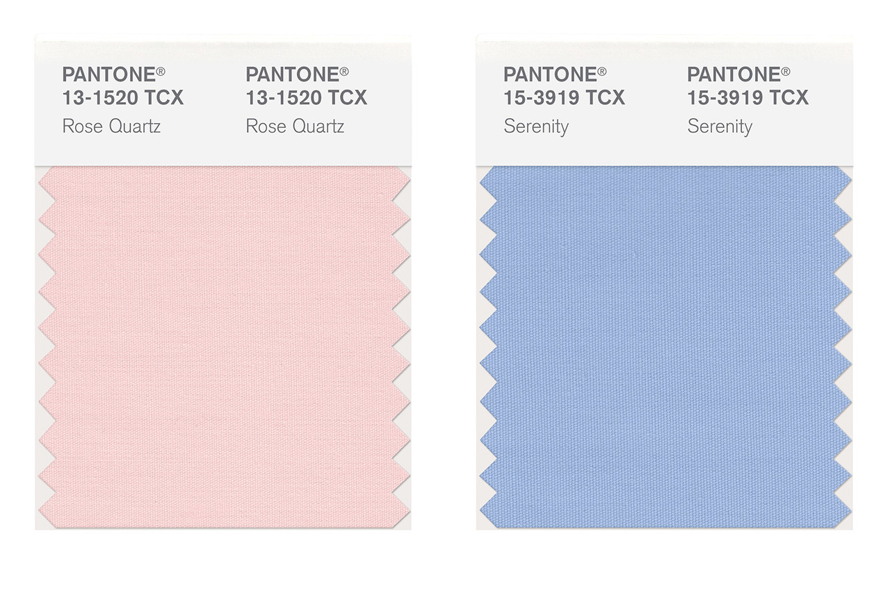
Each December, the design world waits with baited breath for the Pantone Color of the Year-- the hue that will supposedly influence trends from fashion, to art, to graphic design, to of course, home decor. This year's color of the year announcement, which came late last week, was completely unexpected; not because the hue itself was strange, but because for the first time, there were two colors of the year: the pale pink Rose Quartz and the soft blue Serenity. While the color choices have been explained as a nod to everything from gender equality, to a soothing antidote to modern stressors, to the presidential election, we're going to take them at face value for the moment and call them as we see them: Two stunning shades--both alone and combined--that we can't wait to incorporate into design schemes this year.
Love the hues as much as we do? Here, we've put together a few of our favorite room ideas and product picks in the beautiful shades which might just inspire your own fresh and unexpected design ideas.
A gorgeous, modern living room proves the pastel hues don't have to feel overly sweet.
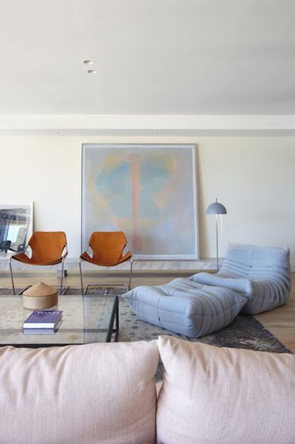
Art from Lillian August is an easy and ethereal way to incorporate the trend.


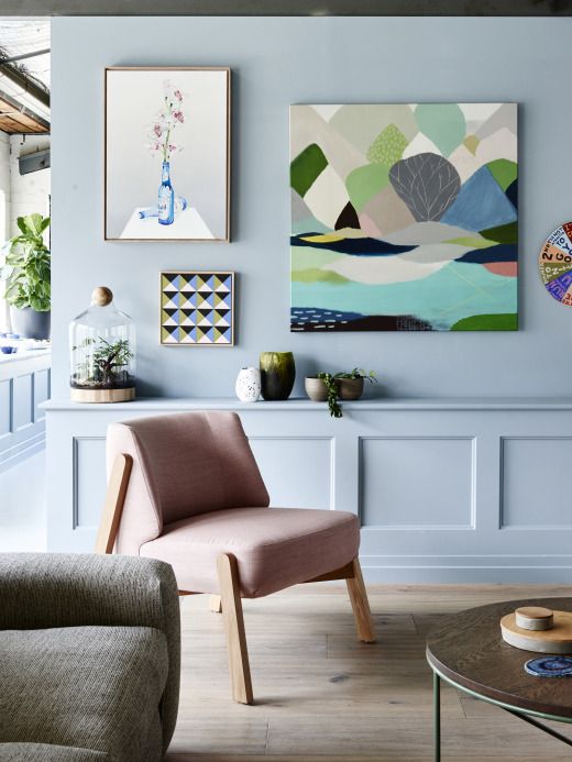
Pastels have been gaining steam in contemporary interior design for a few seasons now, especially paired with pale wood tones like pine.
The glamorous velvet bed in pale pink from Anthropologie could inspired an entire bedroom design.

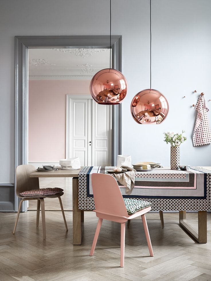
Two trends unite: Metallics and rose quartz come together in these beautiful rose gold pendants.
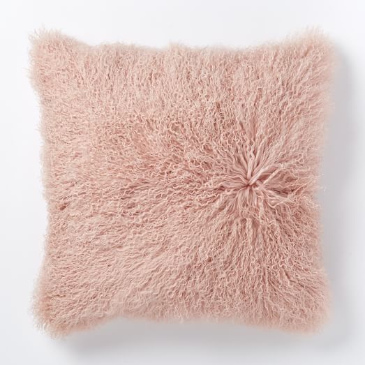
We love inexpensive throw pillows, like these two from West Elm, for trying out a trend without investing too much.

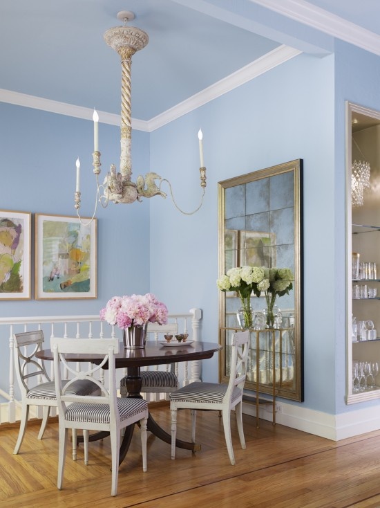
The color combo works in a classic home too, as seen in this Swedish Country inspired dining space, below.
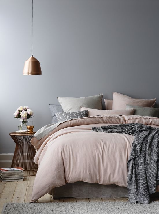
How restful does this bedroom look? The combination of cool gray balances the soft, warm pink to create a cozy, harmonious space.
Our verdict: We're completely in favor of Rose Quartz and Serenity. What do you think about Pantone's picks for 2016?